Forbeslife invited us to reimagine a product from our lives. Two redesigned products from our everyday life are presented here. The first one is a kitchen aid and the second one is an “aankho dekhi” petrol pump dispenser. The Jan-Feb 2016 issue of the magazine carries these new products.
An ergonomic aid for the kitchen

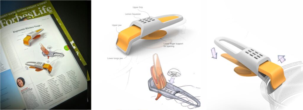
Need – Every Indian kitchen has a pair of tongs for sure. Stainless Steel utensils used in the kitchen very often do not have handles. Normally users prefer utensils without a handle as they are easier to maintain and clean. Cleaning is important specially since Indian cooking involves a lot of frying. Conventional tongs are tricky to grip and one needs to learn to handle them. There are mainly two formats of tongs popular in kitchens but both need the trick of using a staggered finger grip to open and close the tongs. A new reimagined ergonomic grip is aimed to enhance the user experience and make things easy in kitchens.
New Design – The new form uses a full grip with finger support lever to open easily when required. The grip is also made larger for providing more power during holding. The front gripping jaws uses metal inserts to provide strength and silicon rubber flapped grip for better surface contact and also to make it anti-slip. Fingers can easily enter and exit the grip. The product has also been combined with a lemon squeezer to provide quick access to another frequently used kitchen device. This reduces the hassle of cleaning more number of cooking accessories.
Smart Fuel Dispenser – Bringing analog back

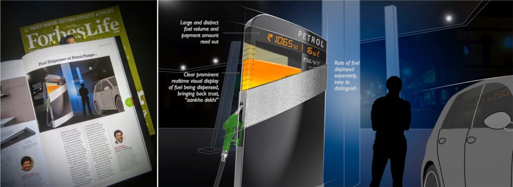
Need – Filling fuel at at a petrol pump/ gas station is a act of faith as far as trusting the quantity and quality of petrol that is delivered to us. Petrol goes straight from the pump to the vehicle. We trust the meter display as the truth. We rarely know if the petrol filled is of the exact quantity. What if the amount of fuel was visible to us right in front of us? In earlier times the design of a pump had an additional glass container introduced to pump the petrol in it manually and then delivered using gravity, Its time to reinvent it in our todays context.
Design – Here is an attempt to bring back real time visibility of the actual amount of fuel being filled by creating an integrated transparent glass container for fuel. Fuel is filled in this one first and then dispensed into the vehicle. One can see the fuel being emptied visually from the container into the tank. Calibration on the container shows clearly the volume level. Visibility of the colour of fuel also adds the extra check for visual quality. Display of the amount to be paid and quantity filled is often a challenge to read (staff at petrol pumps have been found to be notoriously tricking users) here the display right on the top with large digits visible to the users. Rate of fuel is mentioned separately, a relatively static piece of information, not to be confused with other information. Wouldn’t it be better for consumers to have an option of using such a dispenser even if it takes a little more time than normal to have an added assurance of correct quantity being delivered along with peace of mind. Would you use this pump?


